ALaCarte.Direct
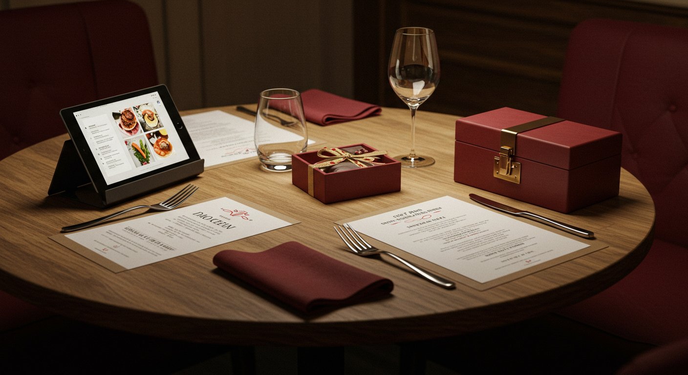
A customer walks into your restaurant, spots a small display near the till, hesitates… then puts the gift card back down. The design didn't convince them. It looked like a supermarket voucher, not a promise of a fine dining experience. This scenario plays out every day in hundreds of independent restaurants. Yet the gift card is one of the few products a restaurant can sell without engaging its kitchen, without booking a table, without even being open. But only if it makes people want to give it.
Your restaurant gift card design isn't an aesthetic afterthought. It's a genuine commercial lever. A well-designed card becomes a desirable object, a communication tool, and a vehicle for acquiring new customers. A poorly designed card, on the other hand, stays in a drawer — or never gets bought in the first place.
This article gives you the practical keys to design a gift card that reflects your identity, catches the eye, and triggers the purchase. Templates, inspiration by restaurant type, mistakes to avoid — everything you need to take action.
Why restaurant gift card design is a commercial priority
Many restaurateurs treat the gift card as a secondary product. They print a voucher on standard paper, slap on a logo, and move on. That's a strategic mistake.
Your gift card is your silent ambassador
When a customer gives your gift card, they're placing your restaurant in the hands of someone who may not know you yet. That card is your first impression. It needs to communicate in a matter of seconds:
- Your restaurant's positioning (friendly bistrot, fine dining, world cuisine…)
- The quality of the experience to come
- The care you put into every detail
A polished design sends an implicit message: "This restaurant takes care of everything, including the things they don't have to." That's exactly the kind of signal that reassures a new customer.
A product with exceptional net margins
The gift card requires no raw ingredients at the point of sale. Costs are limited to the initial graphic design and production (printing or digital platform). Relative to the selling price — typically between £25 and £130 ($30–$150) — the margin is substantial. Investing in professional design pays for itself within the first few cards sold.
What's more, a significant proportion of gift cards are never redeemed. This "breakage" phenomenon represents pure revenue for the business. All the more reason to maximise sales with a design that converts.
A tool for both retention AND acquisition
The gift card has a rare dual quality: it builds loyalty with the buyer (they think of you when looking for a gift) and it recruits the recipient (they discover your restaurant). Smart pricing of your set menus and formulas combined with an attractive gift card creates a virtuous cycle of customer acquisition.
The fundamentals of effective restaurant gift card design
Before seeking inspiration, lay the foundations. Successful design rests on three pillars: visual consistency, information hierarchy, and material choices.
Consistency with your visual identity
Your gift card must be instantly recognisable as coming from your establishment. This means:
- Your colour palette: use the 2–3 primary colours from your brand guidelines. If your restaurant features warm tones (terracotta, gold, burgundy), your card should reflect them.
- Your typography: use the same typeface as on your menu and signage. Typographic consistency is one of the strongest signals of a well-managed brand.
- Your logo: present but not overpowering. It should identify, not overwhelm.
- Your photographic or illustrative style: if your communications use dark, high-contrast imagery (premium food photography style), maintain that register. If you rely on artisanal illustrations, stay in that vein.
The classic mistake: creating a "generic" gift card that could belong to any restaurant. Your card should be as distinctive as your cuisine.
Information hierarchy: what to show (and in what order)
A gift card carries several pieces of information. The design should guide the reader's eye in this order of priority:
- The emotion (photo, illustration, atmosphere) — this is what captures attention first
- The restaurant name — instant identification
- The words "Gift Card" — clarifying what it is
- The amount or experience — what the recipient will receive
- The practical details — validity, terms of use, contact information
Too many restaurateurs make the mistake of overcrowding their card. Remember: this isn't a promotional flyer. It's a gift object. Restraint is your ally.
For a standard-sized physical card (85 × 54 mm, credit card format), limit the front to the emotion, the name, and the words "Gift Card". Put the practical details on the back.
Choosing materials and finishes
How it feels matters as much as how it looks. A gift card is handled, slipped into an envelope, handed to someone you want to treat. The material sends an immediate tactile signal.
For physical cards:
- Thick card stock (350 gsm minimum): anything lighter feels cheap. A heavier weight communicates quality.
- Matt or soft-touch lamination: matt lamination gives a velvety feel, very premium. Soft-touch goes further still with a "peach skin" texture.
- Hot foil stamping or spot UV varnish: a foil-stamped logo or localised gloss varnish on a matt background creates a striking contrast. These finishes are affordable even in small runs from online printers.
- Rounded corners: a simple detail that instantly sets your card apart from an ordinary rectangle of paper.
For digital cards (e-gift cards):
- Subtle animation: a gentle parallax effect or micro-animation on the visual makes a digital card feel more alive than a static PDF.
- Responsive design: the card must look just as good on a smartphone screen as on a desktop. The majority of purchases happen on mobile.
- Personalisation: let the buyer add a message, choose from several visuals, or even schedule a delivery date.
Gift card templates: formats that work in the restaurant industry
You don't need to start from scratch. Here are proven templates you can adapt to your establishment.
Template 1 — The classic "open amount"
Concept: a clean, elegant card with space to write in the amount chosen by the buyer.
Visual layout:
- Front: atmospheric photo as background (dining room, signature dish, table detail), restaurant name overlaid, "Gift Card" label
- Back: "Amount: £___" space, unique number, expiry date, restaurant contact details, terms of use in small print
Best for: all restaurant types. It's the most versatile and simplest format to implement.
Advantage: total flexibility. The customer chooses the amount, which removes the barrier of "it's too expensive" or "it's not enough".
Template 2 — The experience package
Concept: instead of a monetary amount, the card grants access to a specific experience (tasting menu for two, food and wine pairing, Sunday brunch…).
Visual layout:
- Front: a showcase of the experience (photo of the tasting menu, a table set for two, the kitchen workshop)
- Inside (folded card format) or back: description of the experience, what's included, estimated duration, booking instructions
Best for: fine dining restaurants, modern bistrot-style venues, establishments offering distinctive experiences. It's also an excellent format for restaurateurs who host events such as weddings and want to offer taster packages.
Advantage: perceived value is far higher than a simple amount. "A five-course tasting dinner for two" impresses far more than "£100".
Template 3 — The customisable e-card
Concept: a fully digital card, purchasable online and sent by email or text to the recipient.
Visual layout:
- Main visual: one of 3–4 illustrations or photos to choose from (birthday, Valentine's Day, thank you, generic)
- Customisable area: buyer's message, recipient's first name
- Unique code and QR code for in-restaurant redemption
- Integrated "Book a Table" button
Best for: all restaurants, and particularly those wanting to sell gift cards outside opening hours. A solution like ALaCarte.direct lets you set up this type of digital card without any technical skills, seamlessly integrated into your online presence.
Advantage: zero physical production costs, available 24/7, impulse purchases made easy (especially last-minute before a birthday or Christmas).
Template 4 — The collectible card (limited edition)
Concept: seasonal or themed visuals in limited editions that create a sense of urgency and desirability.
Visual layout:
- Season-specific design (autumnal colours, festive atmosphere, spring freshness, summer terrace)
- "Limited Edition — [Season/Year]" label
- Optional numbering ("No. 047/200")
Best for: restaurants with a loyal, regular clientele and premium-positioned establishments.
Advantage: scarcity creates value. Some customers collect them, others buy out of fear of missing out. Either way, you sell more.
Design inspiration by restaurant type
Your restaurant gift card design should reflect your establishment's DNA. Here are concrete directions based on your positioning.
Bistrot and traditional restaurant
Palette: warm, earthy tones — burgundy, cream, olive green, mustard. A touch of gold for a festive feel.
Typography: a classic serif combination (for the name) + a legible sans-serif (for practical information). Handwritten fonts work well as accents, but never use them for body text.
Visuals: focus on authenticity. A photo of your daily specials board, the bar counter, a homemade terrine served in its stoneware dish. Avoid generic stock images — your customers will spot that it's not your restaurant.
Recommended finish: textured kraft or ivory paper, spot colour printing (one or two colours), an unapologetically "handcrafted" feel.
Concrete example: imagine a card slightly larger than a business card (100 × 70 mm), on 400 gsm kraft paper, with your logo printed in burgundy and hot foil stamping for the words "Gift Card". Simple, recognisable, warm.
Fine dining restaurant
Palette: black, white, gold, charcoal grey. Minimalism and elegance. A single accent colour is enough.
Typography: fine, well-spaced typefaces (think Didot, Playfair Display). White space is your best design tool: it communicates luxury and mastery.
Visuals: a signature dish photographed by a professional, in close-up, against a dark background. Or conversely, a purely typographic design with no photo — extreme minimalism works remarkably well for the high end.
Recommended finish: black soft-touch lamination, hot foil stamping for the logo and main text, presented in a sleeve or black envelope. The packaging is an integral part of the design.
Concrete example: a matt black card, text in hot foil gold, slipped into an envelope of the same shade with the restaurant name embossed. The recipient understands before even opening it that they're in for an exceptional experience.
Themed or modern concept restaurant
Palette: dare to use bold colours and sharp contrasts. A Japanese ramen restaurant can play with red and black. A plant-based restaurant with sage green and dusty pink. A burger bar with mustard yellow and black.
Typography: bold display typefaces, or even custom lettering. This is the moment to express a strong personality.
Visuals: bespoke illustrations, graphic patterns inspired by your culinary world, photographic collages. The goal is for the card to become a graphic object that's a pleasure to look at — and that people almost hesitate to use.
Recommended finish: full-colour digital printing to exploit the full richness of the palette. Unusual format (square, round, folded mini-poster) to stand out.
Brasserie and regional cuisine restaurant
Palette: deep greens, browns, ochre, off-white. Terroir and nature-inspired.
Typography: a robust serif for the name, paired with a simple font for text. Avoid excessive rustic styling ("western" or "parchment" fonts) — terroir is about authenticity, not folklore.
Visuals: raw produce (cheese, charcuterie, market vegetables), local landscapes, a detail of a checked tablecloth. Botanical or "market-style" illustrations work beautifully.
Recommended finish: textured recycled paper, eco-friendly printing credentials noted on the back. Your environmental commitment can become an additional selling point.
Design mistakes to avoid at all costs
Certain mistakes come up time and again. Here they are, so you can steer clear.
Mistake #1 — The generic "clip art" design
Recognisable stock images (the classic chef's hat, crossed cutlery, wine glass silhouette) kill your card's distinctiveness. If your card looks like it could belong to any other restaurant, it doesn't represent yours.
The fix: invest in a one-to-two-hour photo shoot at your restaurant. For a few hundred pounds, you get authentic visuals you can reuse on your gift card, website, social media, and menu.
Mistake #2 — Too much information in too small a space
Terms and conditions in 6-point type, three partner logos, a location map, opening hours, your company registration number… We've seen gift cards that looked more like till receipts than gift objects.
The fix: only put what's essential on the card. Direct people to your website for full terms via a QR code. The buyer doesn't need your VAT number to give someone a dinner.
Mistake #3 — Ignoring the digital format
Many restaurateurs only offer physical cards. Yet a growing share of purchases happen online, especially last-minute buys. Not offering a digital version means leaving sales on the table.
The fix: offer both formats. The physical card for the premium in-venue experience, the e-card for online purchases and long-distance gifts.
Mistake #4 — Forgetting a visible expiry date
It's a legal requirement in most jurisdictions: gift cards must clearly state their validity period (in the UK, the Consumer Rights Act provides protections; in many US states, gift cards cannot expire for at least five years). But beyond the legal aspect, a clearly legible expiry date prevents disputes and customer dissatisfaction.
The fix: build a "Valid until: __ / __ / ____" space into the design from the outset. Not on a sticky label added as an afterthought.
Mistake #5 — Not planning any packaging
You're selling a gift. The packaging is part of the experience. Handing over a gift card in a clear plastic bag undoes all the design work you've put in.
The fix: provide a matching envelope, a sleeve, or at the very least some attractive tissue paper. The additional cost is negligible (£0.25 to £1 per unit), but the impact on perceived value is considerable.
Practical guide: designing your gift card step by step
Let's get to work. Here's the concrete process for creating your restaurant gift card design, even without graphic design skills.
Step 1 — Define your creative brief
Before touching any design tool, answer these questions:
- What is my restaurant's positioning? (Casual, fine dining, family-friendly, trendy…)
- Who buys my gift cards? (Regular customers, businesses for staff or clients, tourists…)
- What formats will I offer? (Open amount, experience, both…)
- What budget can I allocate? (From £0 with a free online tool to a few hundred pounds with a freelance designer)
If you host culinary team building activities, consider designing a dedicated gift card template for these offerings. Businesses love turnkey gift solutions for their teams.
Step 2 — Gather your visual assets
- Your logo in high resolution (vector format .ai or .svg if possible, otherwise .png at 300 dpi minimum)
- 3 to 5 quality photos of your restaurant (dining room, dishes, details)
- Your brand guidelines (colours as hex codes, typefaces)
- The text to include (name, "Gift Card" label, terms)
If you don't have professional photos, a recent smartphone in portrait mode, natural lighting, and careful framing can do the job for a first version. But plan a proper photo shoot as soon as your budget allows.
Step 3 — Choose your design tool
Zero-budget option — online tools:
- Canva (free version): hundreds of customisable gift card templates. You adjust the colours, fonts, and add your logo and photos.
- Adobe Express (formerly Spark): a solid alternative with professional templates.
Moderate budget option (£80–£250 / $100–$300) — freelance designer:
- Platforms like Fiverr, Upwork, or 99designs. Ask for a "gift card pack" including the editable source file, seasonal variations, and print-ready format.
Comfortable budget option (£250–£650 / $300–$800) — agency or experienced designer:
- Bespoke creation with full art direction. Typically includes the card's design guidelines, print files, and digital versions.
Step 4 — Prepare the print file
If you opt for physical cards, your printer will need a file that meets specifications:
- Format: high-resolution PDF (300 dpi minimum)
- Bleed: 2 to 3 mm on each side (the trim zone)
- Safe zone: no text closer than 3 mm from the edge
- Colours: in CMYK (not RGB, which is for screens)
Always request a digital proof before approving the print run. Check the colours, spelling, and alignment of all elements.
Step 5 — Order a test print run
Don't order 1,000 copies straight away. Start with 100 to 200 cards to:
- Check the actual result (on-screen and printed colours always differ slightly)
- Test your customers' reactions
- Make adjustments before committing to a larger run
Online printers regularly offer small quantities at reasonable prices. Expect to pay between £0.15 and £0.65 ($0.20–$0.80) per card depending on finishes and quantity.
Maximising the visibility and sales of your gift cards
A flawless design isn't enough if nobody sees your cards. Here's how to maximise their visibility and sales.
In the dining room and at the till
- Dedicated display: place a counter display next to the till. This is the moment when the customer is most inclined to buy (they're already in the process of paying).
- Visible sample card: set out an open, visible card rather than a sealed stack. The customer should be able to see the design without having to ask.
- Staff mention: train your team to suggest the gift card at the right moment. "Did you enjoy your meal? Did you know we offer gift cards?" — a simple question, no pressure.
On your website and social media
- Dedicated page: create a "Gift Card" page on your website, easily accessible from the main navigation. If your establishment has an optimised digital menu, add a link to the gift card directly from the menu.
- Quality visuals: photograph your card in an appealing context (placed on a set table, in its envelope, held in hand). "Product alone on white background" photos don't work well for a gift object.
- Seasonal stories and posts: ramp up communication before every gifting season (Christmas, Valentine's Day, Mother's Day, Father's Day).
During the festive season
The end-of-year holiday season accounts for the lion's share of gift card sales across all industries. Prepare well in advance:
- Launch your Christmas visuals from early November
- Offer a digital "last-minute" option for latecomers
- Create an attractive bundle (gift card + small house-made product: jam, spice blend, olive oil)
For corporate clients
HR departments, office managers, and small business owners are major gift card buyers for restaurants. To win them over:
- Offer corporate personalisation (adding the company logo to the card)
- Provide volume discounts from 10 or 20 cards
- Supply a proper invoice for their accounts
- Suggest your cards as an alternative to traditional gift vouchers for culinary team building events
If your cards include details about allergen information in accordance with regulations, make sure corporate clients know — it's a mark of professionalism and compliance that reassures HR managers.
Summary: your gift card design checklist
Before signing off on your design, run through this checklist:
- Identity: the card is instantly recognisable as coming from your restaurant
- Emotion: the visual makes people want to discover the establishment
- Legibility: essential information can be read in under 5 seconds
- Material quality: the card weight, finishes, and packaging match your positioning
- Compliance: expiry date, terms of use, and contact details are all present
- Consistency: the design fits within your overall brand guidelines (menu, website, social media)
- Variations: you offer at least two formats (physical + digital) or two amounts
- Visibility: a display stand, a web page, and social media visuals are ready to go
Take action this week
You don't need to do everything at once. Here are the three next concrete steps:
-
Today: gather your logo, photos, and brand guidelines into one folder. If you don't have brand guidelines, note down your 2–3 main colours and your usual typeface.
-
This week: create a first prototype on Canva or contact a freelance designer for a quote. Start with the "open amount" template — it's the simplest and most versatile.
-
This month: order a first print run of 100 to 200 physical cards, set up your e-card online, and brief your team so they spontaneously suggest the gift card to satisfied customers.
Your restaurant gift card design isn't an expense: it's an investment in a sales channel that works for you round the clock, turns your customers into ambassadors, and brings new faces to your tables. All without adding a single cover in the kitchen.